PART IVGetting to know the screens
CHAPTER 16
Graphs
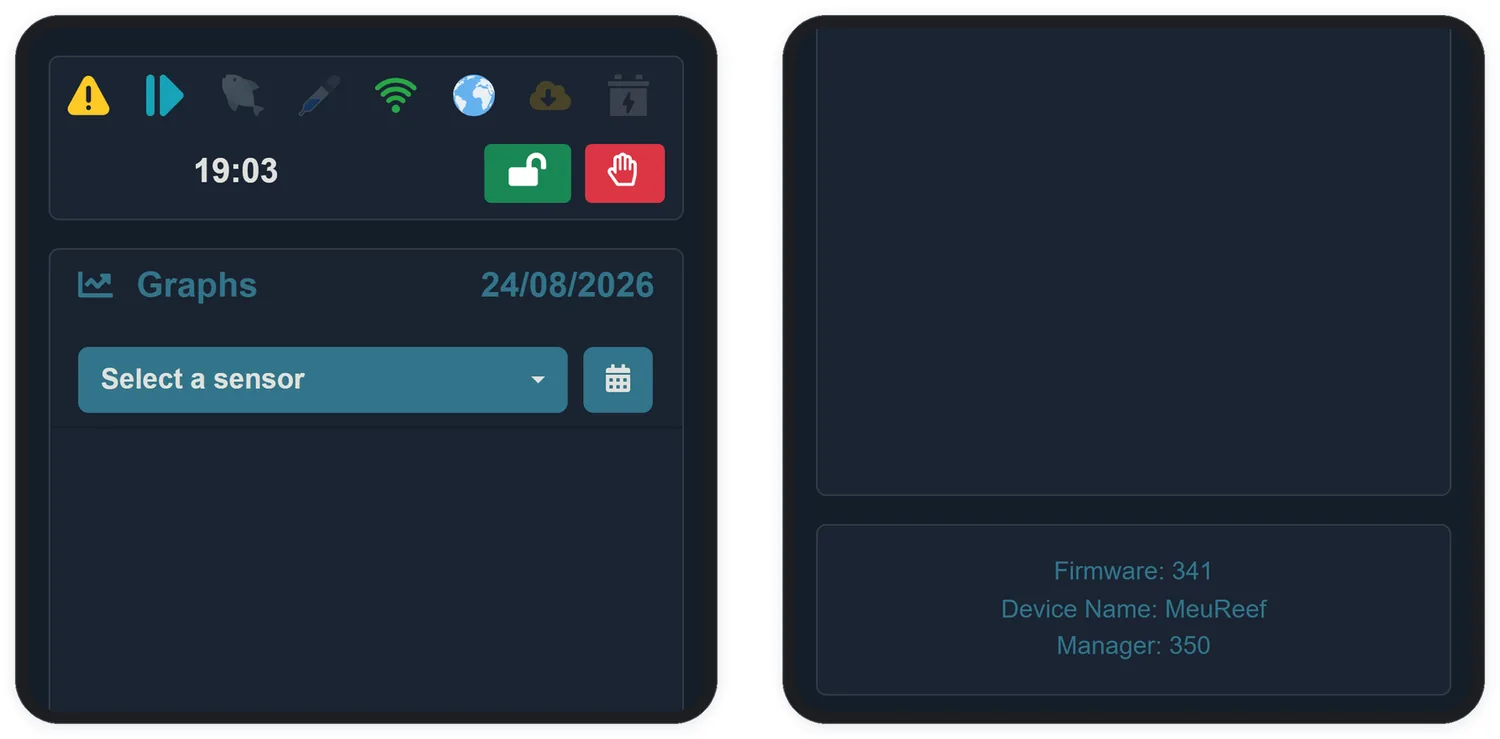
If the Home screen answers "is everything all right now?", the Graphs screen answers "what has been going on?". Each sensor records one point per hour, and here you walk through that history day by day.
16.1 How to use it
- In the Select a sensor list, pick the first sensor — it is plotted immediately.
- Add up to 3 sensors to the same graph; the second one gets its own axis on the right.
- Use the calendar to change the day — any date up to today.
- The − and + buttons adjust the vertical zoom, to magnify small variations.
- The red button removes the last sensor added.
With one sensor selected, the dashed Minimum (blue) and Maximum (red) lines show the configured alert limits — you can see at a glance when the parameter flirted with the danger zone.