Graphs
If the home screen answers "is everything fine right now?", the graphs screen answers "what has been happening?". It is the equipment's most powerful tool for anyone who wants to understand their own aquarium.
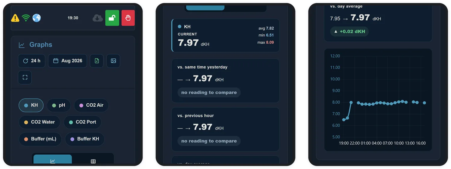
21.1 Choosing what to see
At the top you set the period — the last 24 hours or a specific month — and select the series to display:
| Series | What it records |
|---|---|
| KH | The measured alkalinity |
| pH | The aquarium pH (requires the probe to be calibrated) |
| CO2 Air | Ambient CO2 |
| CO2 Water | CO2 dissolved in the water |
| Co2 Port | The port's drive percentage, hour by hour |
| Buffer (mL) | Volume delivered by the buffer pump |
| Buffer KH | How much alkalinity that dose represented |
21.2 Line or table
The toggle switches between the line graph, better for spotting trends and patterns, and table view, better for checking exact values hour by hour.
21.3 Automatic comparisons
Below the selectors, three cards answer the most common questions without you having to interpret the graph:
| Comparison | What it is for |
|---|---|
| vs. same time yesterday | Isolates the daily variation. If 3 pm today differs from 3 pm yesterday, something genuinely changed |
| vs. previous hour | Shows the recent movement — how fast KH is rising or falling |
| vs. day average | Places the current reading within its own day, separating the normal from the exceptional |
21.4 Exporting
The two icons beside the period selector export the history as a spreadsheet or as an image. The spreadsheet opens in Excel or Google Sheets and lets you build your own analyses, compare months and follow the system's long-term evolution.